
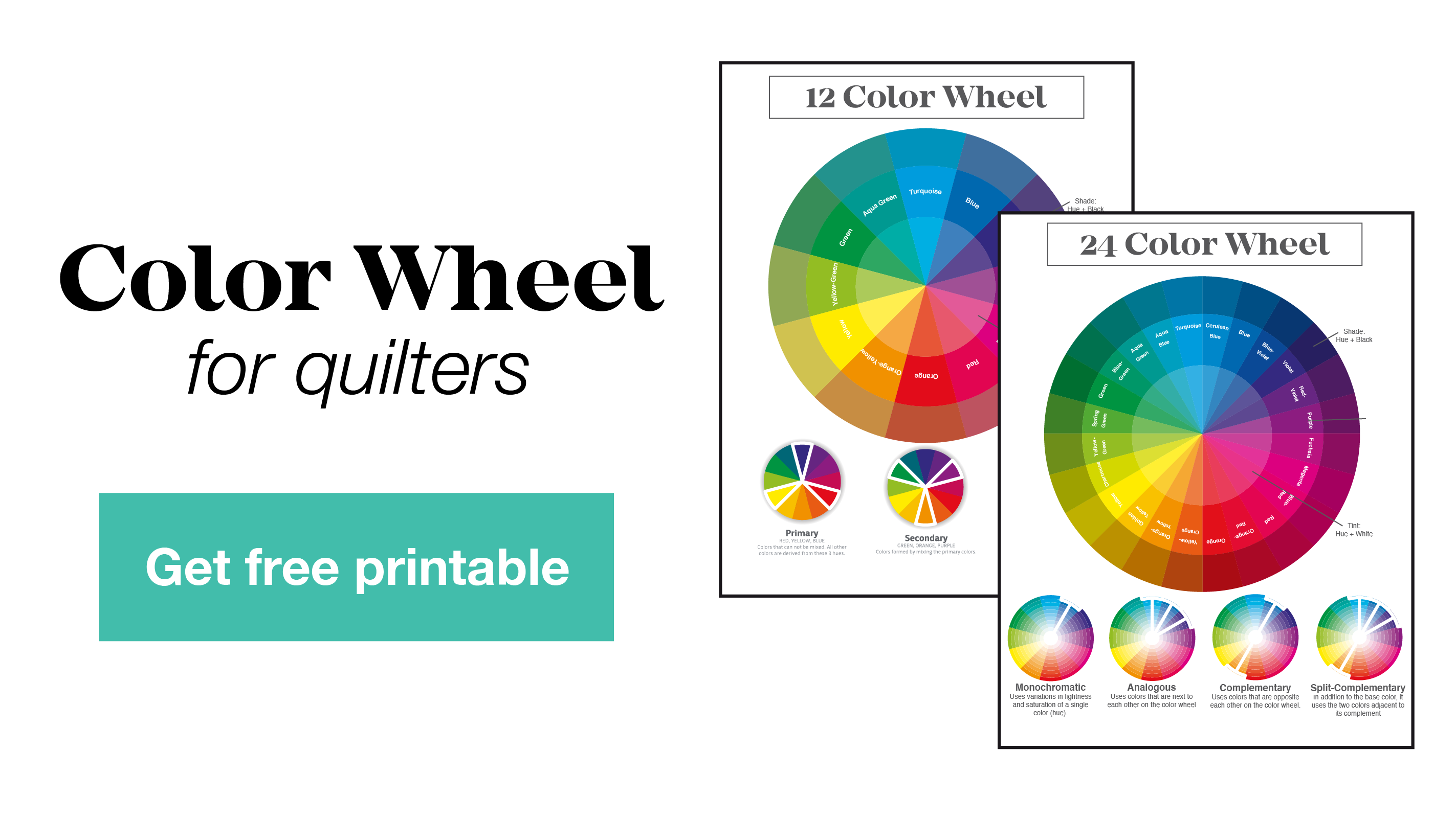
We can approach color selection from 3 different places: science, inspiration, and/or our gut (or eye).
We might start with the science, for example: "Aqua, turquoise, and gold are analogous colors, so I know they will look really nice all together, I think I'll also drop in a neutral, and vary the value to add depth." Or we might start with inspiration, using a photo or a painting to draw colors from. Or we might just pull fabrics, place them together and let our gut (or our trained eye) tell us if they're working or not, using what we know about the science of color to confirm or help us figure out what's going wrong.
Today, let's start with inspiration and use what we know about the science of color (what we learned about analogous palettes) to help us make our decisions. And in the act of paying attention and thinking about color, we are training our eye.
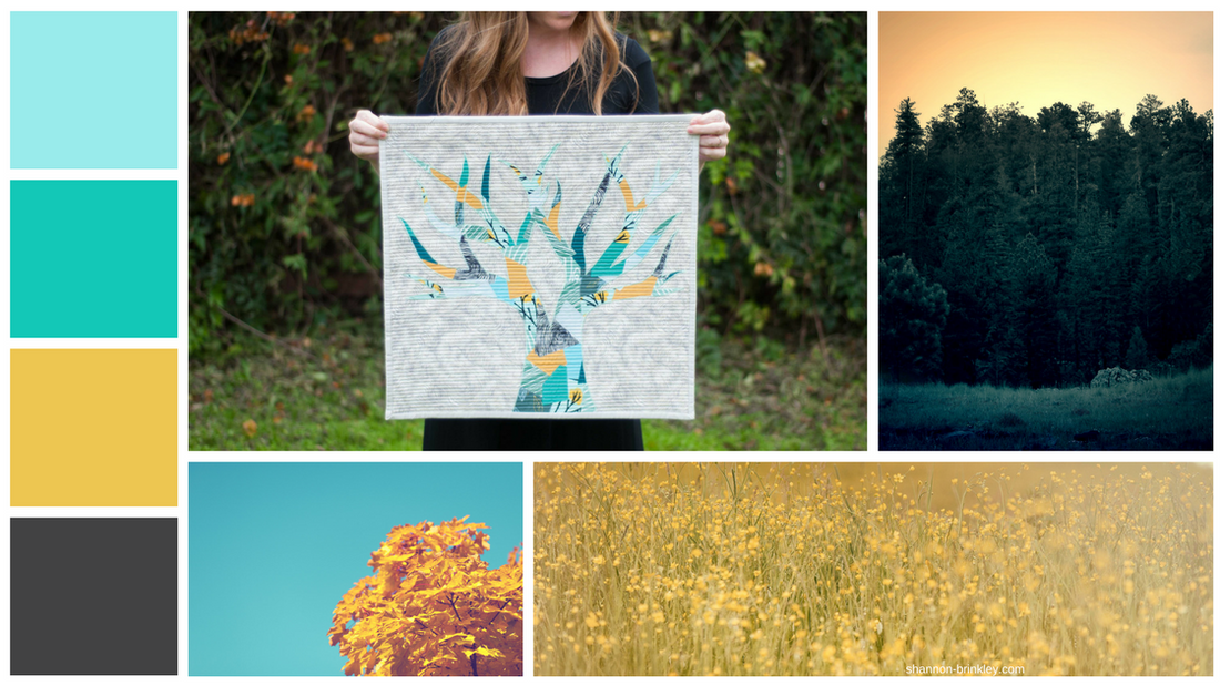
Look at the photo of the forest on the right. At first glance we see gold and green, but let's look a bit closer. Notice the sky is an orangey-gold and the greens have a little blue in them-- especially the grass, it is more of a dark aqua than a forest green. This photo by itself would produce a beautiful palette, but when we bring in this other tree photo, I think the palette becomes even more interesting. These two photos work together, I think, because they both share that orangey-gold, so we can be pretty sure the other colors they are paired with will work too. So even if we didn't know that aqua and turquoise are analogous colors, we can see that these colors all harmonize. 
Artist of all varieties have one thing in common. They pay close attention to what they like and what they don't. Pay attention to what grabs your attention -- the next time you say, "oh wow, how beautiful", ask yourself, what about this is beautiful?
If it is the colors, snap a picture and keep in a color inspiration file. If this palette is inspiring to you, feel free to download it and save it or print it off, placing it in a color inspiration file or save it to an online bookmarking site, like Pinterest.

This pattern can be found in my book.

Again, the more you pay attention to and think about color, the more trained your eye will become to color harmony.
Now, I'd love to hear from you! What is one thing that you draw inspiration from?
3 comments
Nature has always inspired me. But I’ve never thought to use it to create a color palette. Isn’t that interesting! Thanks for inspiring me today :-)
Choosing a color palette can tell a lot about who chose it, because color is very important.
Aw, yay! So glad it sparked some ideas!