

The right colors in a quilt can make any quilt pattern look amazing. As you likely know, there are 3 layers of design in a quilt: the fabric, the quilt pattern, and the quilting design. Often we spend so much time thinking about the latter 2 that the fabric (or color!) selection is an afterthought. Or we don't feel confident about our ability to pull fabrics together from our stash, so we grab a precut or stick with fabrics all from the same collection. And we wonder why our stash never seems to dwindle!
Having an "eye for color" is something you can learn and grow.
The goal of this blog series is to help you train your eye to recognize color harmony, be able to figure out what is or isn't working in a fabric pull, and ultimately pull together fabulous color palettes that make you want to dance and that create gorgeous quilts! We will do this by learning how color works (the science of color), learning how and where to find color palette inspiration, and training our eye through various fun little exercises.
If you missed any of the previous articles, you can find them below. (If you like this article, you might want to sign up at the bottom for email updates, so you don't miss the other lessons in this series.)
Color Confidence for Quilters:
- Lesson 1: The Color Wheel
- Inspirational Palettes 1: Seeing the Subtle Hues in Nature
- Lesson 2: Monochromatic Color Palettes
- Inspirational Palettes 2: Pulling a Fabric Color Palette -- using Science, Inspiration, and your Gut
- Lesson 3: Analogous Color Palettes (This post!)
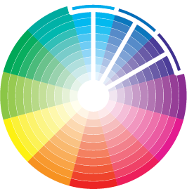
Classic Color Palettes: Analogous
This is the second post about classic color palettes. Last time, we talked about monochromatic palettes (a monochromatic color palette is made entirely from a single hue). Analogous palettes is similar, but also brings in the hue's neighbors.An analogous color palette contains colors that are next to one another on the color wheel.
SAMPLE PALETTES
Analogous color palettes are very simple, but can create really lovely and harmonious effects in a quilt.
HOW TO USE THIS PALETTE
There are so many different and fun ways you can use a analogous palette. Below are some ideas you might want to try out. These are not rules, mind you! I don't believe in rules when it comes to color; these are just some ways I like to use this palette.
Idea: Have analogous pops
In the example below, we have a monochromatic palette (the blues) with pops of the analogous color (the chartreuse).
Flock of birds pattern can be found here.
Idea: Play with Value!
I love including darks, mediums, and lights for a really dynamic look. If I want a more subtle look, I might keep all the values closer to one another (i.e. have all lights and mediums or all mediums and darks).
Idea: Include a multi-colored print that contains a color from your analogous palette.
The other colors in it will add fun & subtle pops!
The Austin Skyline Quilt in the upper left corner contains a bunch of greens, aquas, and yellows, along with a few black & white prints, but I also included a print that has green in it (so it will blend nicely with the rest of the quilt) but also has some purple in it, which provide some nice pops. I know this isn't technically an analogous palette, but it's a great option if you like the analogous look, but want to add just a bit more color.  Patterns for these quilts can be found here: Austin Skyline, Lion, Bear, Paris Skyline
PRACTICE
The Exercise: Pull an Analogous Color Palette

The more you play with color palettes, use your color wheel, and think about/notice color, the stronger your color intuition will grow.
Next week, we’ll explore another inspirational palette, and the week after we’ll continue learning about classic color palettes, moving on to Complementary Color Palettes!
Subscribe below to get email updates so you don’t miss the other lessons in this series! I send out a weekly email with free patterns, tutorials, or free lessons (like this one!), along with updates about what I’m working on.
Now, I’d love to hear from you! What is one insight you took away from this? Have you used analogous color palettes in quilts in the past?
1 comment
This series seems like it will help me be more comfortable choosing fabric combos.
Thanks