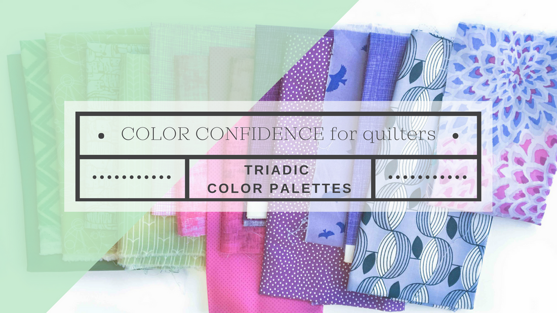
As a quilt designer, this might be heresy to say, but I think fabric selection is even more important to the overall look of the quilt than the actual quilt pattern. And the most important element of fabric (even more important, I think, than the design) is color!
The color palette we choose for our quilts make a world of difference. Fabric selection, though, is an area with which a lot of quilters struggle. This usually stems from an uncertain understanding of color. This is why I decided to write this series, Color Confidence for Quilters-- there are some simple formulas and rules of thumb that can take you from uncertain to confident and bold! If you missed any of the previous posts, you can catch them using the below links.
If you like this article, be sure to subscribe at the end of the post to get email updates so you don't miss the rest of this series!
Color Confidence for Quilters:
- Lesson 1: The Color Wheel
- Lesson 2: Monochromatic Color Palettes
- Lesson 3: Analogous Color Palettes
- Lesson 4: Complementary Color Palettes
- Lesson 5: Triadic Color Palettes (This post!)
- Inspirational Palettes 1: Seeing the Subtle Hues in Nature
- Inspirational Palettes 2: Pulling a Fabric Color Palette -- using Science, Inspiration, and your Gut
- Inspirational Palettes 3: How to Choose Fabric Colors for a Quilt -- using nature as inspiration
- Inspirational Palettes 4: Choosing Fabric Palettes that Reflect your Uniqueness
Classic Color Palettes: Triadic
The past several weeks, we've been exploring different classic color palettes. These are some basic color formulas, and as a math nerd, myself, I love a simple formula. Today is the last of these that we'll look at in this series-- the triadic palette!
Tri- prefix meaning ‘three’.
A triadic color palette uses 3 colors that are evenly spaced around the color wheel.

SAMPLE PALETTES

HOW TO USE THIS PALETTE
Triadic palettes can be a little intimidating since you are working with more colors, but just like in the other classic palettes, once you understand how it works and think about a few tips, creating your own triadic palette will be much easier!
Tip: Play with Value
If you've been following along with this series, you'll notice this tip in every post! Varying the values (remember value means the darkness or lightness of a color) is a super simple way to make a palette more interesting. Look at all the sample palettes above-- notice that in each one, the first two squares are the same color, but one is light and one is dark, this adds interest and creates balance.
Tip: Play with Saturation
Playing with saturation is how the pros can place any colors together and make them look fabulous. Remember: saturation is the intensity of a color, or the brightness. For example, look at the blues below. They are the exact same hue, but the left one is brighter (or more saturated) and the right one is less bright (or less saturated).

Notice in the sample palettes above, I included fabrics with high and low saturation as well as some in the middle. Sometimes placing all highly saturated fabrics together looks a bit too intense, while using all low saturated fabrics my appear too dull. Try mixing and matching for a more balanced look.
Tip: Play with Quantity
This simply means use more or less of certain colors. So, if you love blue, for example, but want to include more colors, choose several blues and just a couple other colors to serve as "pops". You don't need to include an even number of fabrics from each color.
 You can find the above patterns here: Skyline Patterns (the one pictured is Milan), Around the World Quilt (pattern is in my book).
PRACTICE
The Exercise: Pull a Triadic Color Palette

The more you play with color palettes, use your color wheel, and think about/notice color, the stronger your color intuition will grow. Stay tuned as we continue to learn about how color works, especially as it related to quilting.
Now, I’d love to hear from you! Do you have trouble putting together a more colorful palette? Think this formula is one you might like to try? What area of color would you like to learn more about?
Subscribe below to get email updates so you don’t miss the other lessons in this series! I send out a weekly email with free patterns, tutorials, or free lessons (like this one!), along with updates about what I’m working on.


5 comments
Thank you for the great tutorial on color. I love the bright, cheery colors, but know it doesn’t always work together. This is a great series!
I received this July 12, 2017 blog today, Oct. 10. I clicked on your link to download your color wheel, but apparently it’s not working now. Can you help?
Thanks,
Linda
I am in the process of making the scene of Lincoln Ne. for a dear friend and mentor who has lived in there for many years but is retiring to Boston next year. The Boston area is where her family and many of her children live. I want to use a gold sparkling fabric for the gold tower of the capital building but am not sure that will look very good. Should I just use a gold cotton instead? Will be using lots of greens and browns in the rest of the picture, to represent the agricultural areas of the state and her husband’s (now deceased) work for the University as a researcher in this area. Any suggestions?
Hmm, greens and browns will go nicely with gold. It is hard to know if the sparkling fabric will look good without seeing it. If you want to email a photo of the fabric you are planning to use, I’d be happy to share my opinion! shannon(at)shannon-brinkley(dot)com. The project sounds so special — I’m sure your friend will treasure it!
[…] Lesson 5: Triadic Color Palettes […]