
Have you ever tried to pair two colors that you know should go together based on the color wheel, but they just didn't look great to you?
For example, with a little bit of knowledge of the color wheel, we know that colors opposite one another on the color wheel are complementary, and will go well together. (See the complementary pairs below.) But how do I turn this into a fabric palette? Also, I don't love bright magenta next to bright green-- how can I make the palette look more interesting and mature?

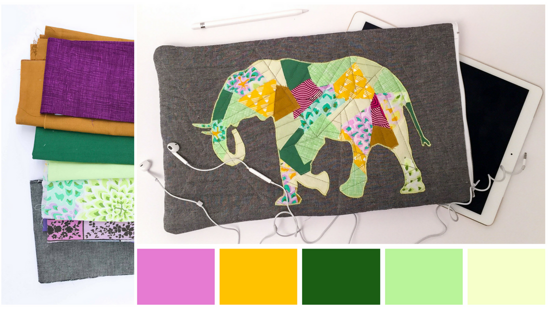
If you've been following these color posts, you've heard me talk about value and saturation a lot! They are magic dials that you can turn up or down to make ANY colors work together.
The trick, I think, to making two complementary colors look nice together, and not too abrupt or wild, is to vary the values (darkness/lightness) and saturation (brightness/dullness) of one or both the colors. Including some paler and duller greens helps this palette to not look too intense.

In addition to the green and magenta, I added in some golds (since they are right by green on the color wheel) to make the palette more dynamic/interesting, and placed the bright appliqué piece on a neutral, charcoal background.
Find the elephant and other animals patterns, here, and the tutorial for this tablet/computer case, here.
Happy sewing!