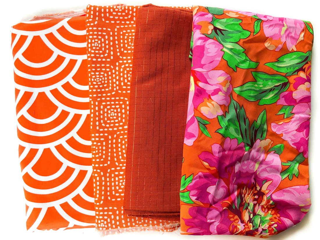
Today I'm going to share one of my favorite methods to add a pop of color to your quilt: it's called the Print Pop!
Let's say you know you want to make a mostly orange quilt, but you want to add a pop of color somewhere, but would like it to be subtle...
Enter the Print Pop!
Grab a bunch of oranges, like I've done below (mono-chromatic, tone-on-tone, blender prints work great), maybe also add a solid or two.
Next grab a print that has orange in it, but also has other colors as well!
The pop of color (in this case pink and green) comes from your print: The Print Pop!

The Print Pop is a simple and subtle way to add that fun pop of color and interest to your quilt, and one I use time and time again.
Notice how, with the other orange fabrics, I also played with scale: I included a small, medium, and larger-scaled print. This variety also adds a lot of interest and balance in your print palette.
Give this a go -- start with a single color and grab some "blender" prints of that color, then find a print that is multi-colored, but includes your original color! Leave a comment below to let us know how it goes!
If you'd like to dive deeper into color, we have a full Color Curriculum inside Meander. It will take you from unsure or insecure with color to a master! Click here to learn more!
Do you have a favorite way to add a pop of color? Leave a comment below and let us know!


10 comments
I go to the color wheel and I use a color as my neutral. Example: Double wedding ring with pastel ring pieces in blues, yellows and peaches. I used a rust for the background and it turned out beautifully.
love the ideas
I filled out your questionnaire, but I am not sure it went through.
MY PROBLEM IS THAT ONCE I HAVE GRABBED THESE FABRICS I CAN’T FIGURE OUT A PATTERN TO USE FOR THEM.
I apologisz, but I try to contact you, and I have no response. It is about the meander Guild, I had send you a few mails, and contact you by your site , but no responses. Would you send me a response?