Ever planning your fabric for a project and ask yourself:
How can I make this section POP?
Today we're talking about the magic little tool called temperature!

There are warm colors and cool colors. Warm colors (generally, yellow, orange, and red) will POP, while cool colors (blue, green, purples) will recede.
This is such a helpful tool to keep in mind for any type of quilt. Imagine you're making a star pattern block quilt, and you want the spokes of the star to really stand out. If you make the stars a warm color with a cool in the background, the stars will pop out while the background will visually recede.

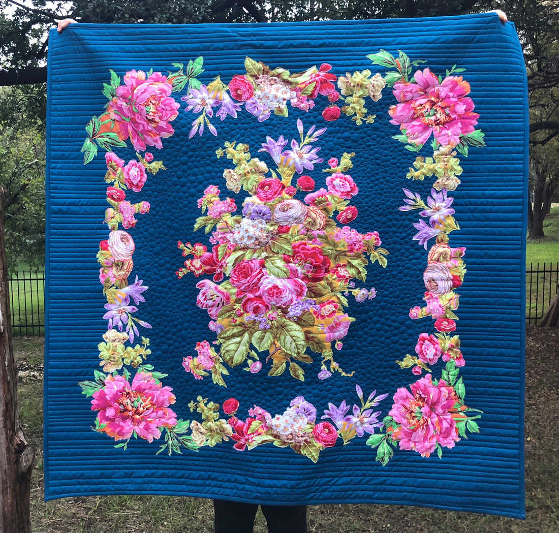
In this quilt I made for our Broderie Perse Workshop in Meander, I started with the floral fabrics, and since they were all quite warm, I knew a cool color would really allow them to stand out. Also since they were a little on the lighter side, I chose a darker color to provide further contrast.
I love how that dark aqua really allows those flowers to pop!
If you'd like to dive into color deeply, we have a full Color Curriculum in Meander that is GOOD. We'd love to have you join our creative community, click here to learn more!
Now I'd love to hear from you! What is your biggest challenge when it comes to color? Do you have any favorite color combinations? Leave a comment below and let us know!


6 comments
It’s something that you think you really already know but having this quilt as a visual sure makes it sink in! Thanks
Have Korean embossed fabric ina rainbow of colors. Focal fabric, royal blue lime green and peach. Special quilt bought in Korea and need a dragon on quilt. There is no blue, peach, or green in the fabric. Any suggestions.
I love the little tidbits of advise. It is very helpful and quick to read…….so I actually read it.
Acela
So clear and succinct in your color tip. Thanks for taking away the fear. Your quilt example is luscious.
This is so beautiful, your advice is spot on.
Thank you