
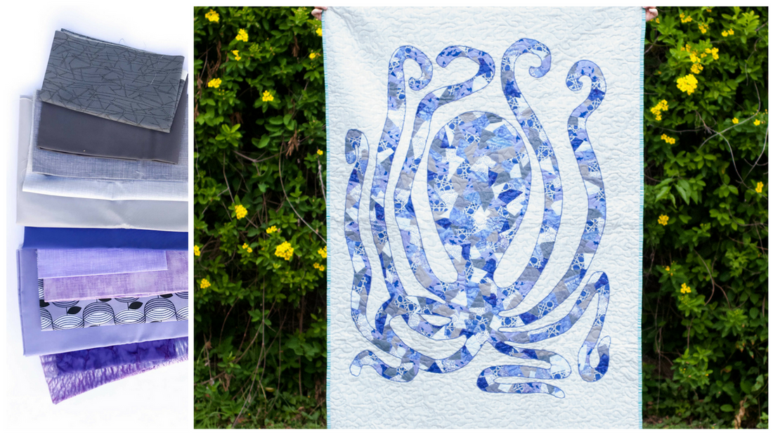
I love these violets and purples alongside these cool grays. It makes for a stark, almost eerie palette. Perhaps it's only eerie since it is made into a giant octopus... who can say?

Not all grays are created equal. Grays can have blue, green, or purple undertones, so I chose some grays with purple undertones to blend smoothly with this purple and violet palette. Had I chosen green-ish grays, I think it would have looked a bit off. See my article on neutrals if you'd like to dive deeper on the undertones found in different neutrals.
Here is another purple quilt, but with a totally different feel.

I think the brown binding and green backing really warm this guy up. This was one of my very first Scrappy Applique quilts, and a version of this pattern ended up in my book.
What is your favorite color to quilt with? Leave a comment below.
1 comment
Hi there Shannon. I’m falling in love with your applique and am looking for a way to print your pattern for the placemats. I have 17 great- nieces and nephews ranging from 12- newborn that I think would love their own placemats. Can you help me out please?