
I wanted to share with you one of my favorite tricks for showcasing the focal point in a quilt.
Let's say you've just made a gorgeous appliqué piece and you're trying to choose a background fabric that will really show it off. Or you're making a block with a really great star motif that you want to pop. Choosing the right "ground" fabric can make a huge difference in the impact of your quilt.
Ground fabric (or background fabric) is the fabric that is behind or around the focal point.

So in this quilt, the navy fabric is the "ground".

In these rust colored bear claw blocks, the beige is the "ground".
I find that it is often easy to pick the fabric you want to use for your focal point, but it can be a lot harder to decide what to use for the ground. I frequently use a neutral for the ground, and it is an easy choice. It will quietly recede while your focal point pops. But there is another option that will provide MAXIMUM impact!
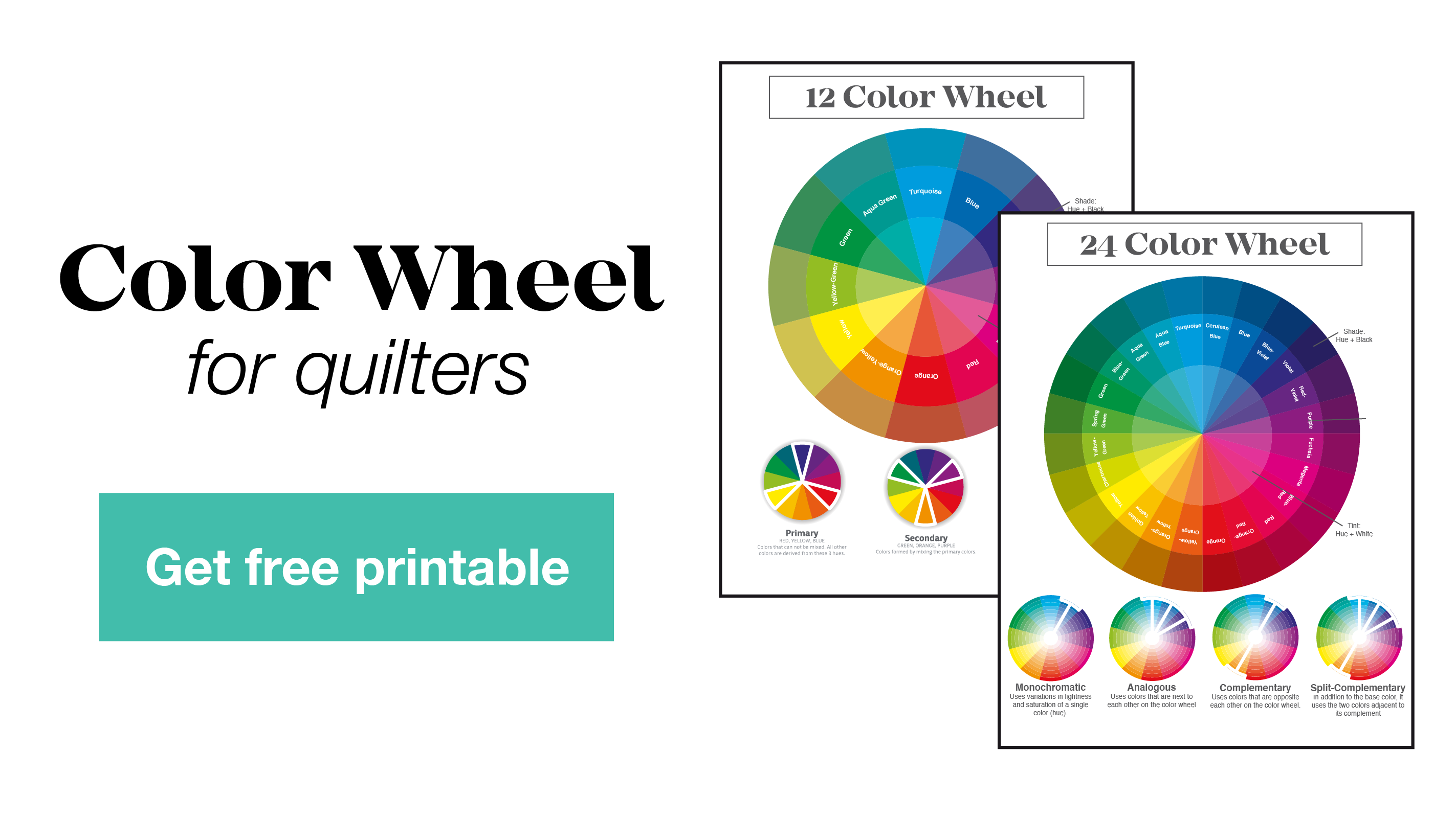
Choosing a color on the OPPOSITE side of the color wheel for your ground will make that focal point pop as much as it possibly can.
Colors opposite one another on the color wheel are called complementary colors. They have no colors in common-- they are as different from one another as you can get.

Yellow and violet, for example, are complementary colors. They are opposite one another on the color wheel and share no common colors. There is no yellow in violet. Therefore violet will look MOST violet when placed next to yellow. Yellow will look MOST yellow when placed next to violet. They make the other really stand out, which is exactly what you want to achieve when you have a gorgeous motif you're trying to emphasize in a quilt.

For this quilt, I knew I wanted 4 skylines that ranged in color from yellow to a reddish-orange. Since blue is opposite orange on the color wheel, I knew it would make a great background to really allow those appliqué pieces to POP!
(Find over 100 different skyline quilt patterns in my shop)

Now, they don't have to be exact opposites on the color wheel to provide impact, like in the above GLOBE quilt, but the further away on the color wheel you get from one another, the bigger the contrast.
This is by no means the only way to draw the eye to your chosen focal point, but it is a great tool to keep in mind when you're pulling fabric for your next quilt.
I'd love to hear from you! What are your favorite color combinations? Do you have any that you find yourself repeating over and over? (Like my gold/orange + blue combo)