
Let's talk PATTERN!!!
We all have those fabrics in our stash. The show stoppers. Those prints that practically jumped off the shelves at the fabric store and into your cart!
They are large in scale, bold, and so pretty, you're a little nervous to cut into them!
What if if doesn't look good cut into tiny pieces?
What if it looks too wild paired with other prints?
Now, in a previous post, I shared how you can use small, medium, and large-scale prints in your palettes to create a really balanced look.
Today, I want to share how you can include multiple large-scale prints in the same quilt to achieve a really interesting, patterned look!
Let's dive in!
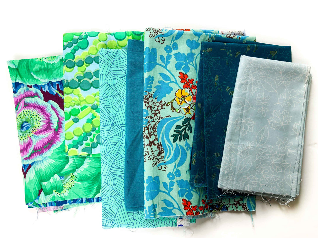
Now, when we're playing with large-scale prints (like the 3 large scale prints shown in this photo), we want to strike a balance between a fun, patterned look, and a hot mess where the fabrics are all so attention-grabbing that they compete with one another.
And your perfect balance will likely look different than mine or your other quilty friends. Some of us want A LOT of visual interest with pattern on pattern on pattern, while others prefer subtlety and like using pattern in small doses. Neither is right or wrong, it's all a matter of preference.
For those of you who enjoy a more patterned look, but want to make sure the patterns aren't competing with one another, take a look at this palette I pulled together.

1. Start with a "Show-Stopper"
I started with the fabric on the left: big, beautiful, and colorful! Make sure it's a fabric that really lights you up.
2. Grab another "Show-Stopper" (or 2) with common colors
Then I found another large-scale print (the second one with what look like green beads) that had colors in common with the first. Now these are both large-scale, and thus attention-grabbing, but since they have colors in common, for me, it isn't too much.
Next I found that third large-scale print (the one in the middle), and again, chose one that had colors in common with the others, and added it to the mix.
Notice that those 3 prints, while all being large-scale and "flow-y", they still are very different-looking prints. So there is enough contrast between them that the patterns won't start to run together, in my opinion.
3. Fill in with Supporting Actors
Now, to fill out this palette, I added in some small-scale, "blender" prints and a solid. This is the BEST way to help those show-stoppers to really stand out. Think of these as supporting actors, they help the others to really shine.
Very often quilters will get stuck because they've chosen a few "show-stoppers", but feel like their pattern is missing something or too busy. The answer is fill out that palette with Supporting Actors: solids, textured solids, blenders, small-scale prints.
There you have it! Create a fun, patterned look without the patterns competing with one another.
If you'd like to dive into color deeply, we have a full Color Curriculum in Meander that is GOOD. We'd love to have you join our creative community, click here to learn more!
Now, we'd love to hear from you: do you have some of those "show-stoppers" laying around that you haven't known how to use? Do you lean more to the wild/patterned side of the spectrum or the subtle/minimalist side? Leave a comment below and let us know!
14 comments
How much would this cost? I am interested, just beginning to learn. Reviewed hundreds of videos! So many different opinions and options. Just made a mug rug, key fob from a kit, and pot holder for a friend’s birthday gift. She loved it but I think I could have done better, but I am not quite at the confident level yet! I know there is much for me to learn. Can’t wait to join! Thank you. I love the color class, it helped me a lot!.
What a beautiful space can’t wait to the see it when everything is complete.
great topic, was just looking at my stash and wondering what i was going to do with a few fabric pieces that are really colorful large prints. i tried to pull together similar colors to go with the prints but did not try to blend them with the color palettes rather was looking to show case each one separately. think I will try using them in combination, because separate they were just blah or over whelming. thanks for the tip
I’m still having a hard time picturing something made with those fabrics. Do you have a picture of something made with those fabrics?